Annestasia_Assessment2
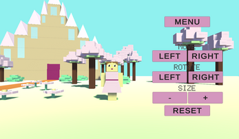
A simple Grey box project. The theme is Minecraft, Girly Edition, and it contains a simple game scene with a Castle and a Princess. In the castle scene there are different functions that can change the position and rotation of the princess.
I have tried to create a good User Experience by making feedback on buttons, using my knowledge on the use of colors, and thought about visability on the different objects.
| Status | In development |
| Platforms | HTML5 |
| Author | AMoller |
| Genre | Adventure |
| Made with | Unity |

Comments
Log in with itch.io to leave a comment.
This game feels like a Minecraft game. The color combination of green and pink complements your main object too. I love how you have been careful with small details such as those benches and castle at the very back. However, the button placement seems to be in between the science you can place the bottoms towards the bottom for an easy user experience navigation.
Very cool game, the colors are pretty and repeated around the game, and there different shapes that work well togehter. The headlines for the buttons could maybe be a little bigger clearer, the girl could maybe be moved more to the front so she stands more out for better UX, otherwise not much to point out.
Very pretty game, with a lot of details. I love that.
For better UX, you could consider making the text on the buttons smaller, for following the UX best practice.
Very Minecraft like style, the theme is really obvious in this one. A bigger headline in the mainmenu would look nice and maybe also stick to the same font throughout for continuity. I would like it if your character was more centered from the start and the colors where a bit more bright, she kinda disappears and seems unimportant. Some past feedback is missing because you hav not implemented two of the buttons on your menu, should probaly not be there to avoid confusion.
Your design is so pretty and the girl adorable in the pink dress. Good usability, but it might be a good idea to make the text (move, size, and rotate) easier to read; with the trees in the background, it can be difficult.